Woodstock
⭐⭐🦐
I think it is more of an “optical illusion” from the photos.I was all in on this and about to buy both, but the pictures taken from home have put me off somewhat...
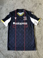
View attachment 27883
I lined the bottom of that box against the top of the seaxes, that sponsor logo is wonky
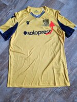
View attachment 27884
Likewise, put a square against the edge of the Macron logo and then put over to the right hand side of the crest. Off centre.
I know this is total pedantry, but if you're charging £50, make sure the printing is right. I took back a shirt a few years ago as the Insure and Go logo looked like it had been done drunk.
So it means I'll be going into the club shop to find the least worst.
I will say the training 1/4 zip training tops though are supoib this year and a steal at £25
As per my pictures the Macron logo and the club badge are both positioned centrally in line with he collar. Both red boxes are the same size showing the solopress logo positioned centrally.
On the away the material appears bunched up around the club badge probably causing the sponsor to appear wonky.
Attachments
Last edited: