• Welcome to the ShrimperZone forums.
    You are currently viewing our boards as a guest which only gives you limited access.

    Existing Users:.
    Please log-in using your existing username and password. If you have any problems, please see below.

    New Users:
    Join our free community now and gain access to post topics, communicate privately with other members, respond to polls, upload content and access many other special features. Registration is fast, simple and free. Click here to join.

    Fans from other clubs
    We welcome and appreciate supporters from other clubs who wish to engage in sensible discussion. Please feel free to join as above but understand that this is a moderated site and those who cannot play nicely will be quickly removed.

    Assistance Required
    For help with the registration process or accessing your account, please send a note using the Contact us link in the footer, please include your account name. We can then provide you with a new password and verification to get you on the site.

2022-23 Season Kit - (H/A)

Personally I like the whole look of it even the crisp clear sponsorship name on the front. Lovely blue and white.

As for this yellow bollocks. Apart from the 1910/11 kit we were always blue and white then in 1985/86 some idiot decided to add yellow. Ok I know it does look good but is just not THE BLUES. I won't even start on the pansy pink.
 
It's not the worst but not the best.

Not a fan of the sponsor without much of a logo and even less of a fan of the shorts. They should have been a different colour.

I'll probably purchase one but I do like the buttoned training top
 
Like it.

Sponsors logo or lack of one looks proper tin pot. 🤨. Shame really im sure there's probably at least 100 people on here myself included that could have knocked up something better in photoshop in 3 minutes...
might be tin pot but it brings in cash for the club
 
Of course, just sort of making the point that you dont have to be an artist or clothing designer to realise it looks naff, and a bit of design would have helped.
if it brings much needed revenue surely thats what matters .I dont really care whats on the shirt its the boots that put the ball in the net and gets us a win that all that counts .
 
It’s really growing on me, just a bit too much white. If the Away were to be a flipped version with yellow as the main colour and Blue replacing the white I think that would be great.
 
Every year our kits get worse.

Shocking - is this really the best we can come up with. Sorry, not a fan.

Re: Sponsorship, can we seriously not get a locally based corporation to sponsor our shirt ? Olympus are one of the biggest employers in Southend and just a stones throw from Fossets. The current sponsor / logo looks Sunday league - am I being harsh?
 
I genuinely think this season it really doesn't matter what the front of shirt looks like. What's important is that we have a deal which gives the club money which it desperately needs. Let's face it our opening financial status for this season has been nothing short of appalling but the encouraging thing for me is that we have recruited well so far, and it's what is inside of the shirt that's important not the words on the front. I want opposition players and fans to be blown away by our football, and if they and us are, then that will be the memorable thing for me.
 
Every year our kits get worse.

Shocking - is this really the best we can come up with. Sorry, not a fan.

Re: Sponsorship, can we seriously not get a locally based corporation to sponsor our shirt ? Olympus are one of the biggest employers in Southend and just a stones throw from Fossets. The current sponsor / logo looks Sunday league - am I being harsh?
:Thumbs up:
 
Every year our kits get worse.

Shocking - is this really the best we can come up with. Sorry, not a fan.

Re: Sponsorship, can we seriously not get a locally based corporation to sponsor our shirt ? Olympus are one of the biggest employers in Southend and just a stones throw from Fossets. The current sponsor / logo looks Sunday league - am I being harsh?
Olympus? My arse, they paid their employees Micky Mouse wages.
 
Of course, just sort of making the point that you dont have to be an artist or clothing designer to realise it looks naff, and a bit of design would have helped.
But it's not just a case of doing a bit of design, to make this happen someone would have to do a full rebrand of PG Site Services, apply that branding to all their equipment, etc...
 
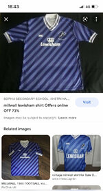
Really really like it .. a company have turned up and sponsored us for 3 years and you’re upset their font isn’t how you wanted it ?? Remember millwall with Tony and teddy
 

Attachments

  • A64994A5-8873-45D4-8F78-4DC538ED632D.jpeg
    A64994A5-8873-45D4-8F78-4DC538ED632D.jpeg
    184.4 KB · Views: 143

ShrimperZone Sponsors

FFM MSPFX Foreign Exchange Services
Estuary MFF2
Zone Advertisers Zone Advertisers

ShrimperZone - SUFC Player Sponsorship

Southend United Away Travel


All At Sea Fanzine


Back
Top